You have made your mind: using Adobe InDesign, you will create a new publication in your language and then produce translated versions of the same, via automated workflow. Great idea.
But have you thought of how to avoid the numerous pitfalls related to multilingual typesetting, such as: not enough place on the page for lengthier languages, translations that do not fit in tables, font which prevents the use of some foreign characters, and many more?
Here are some do’s and don’ts which will save you a lot of grey hair, time and budget.
- Don’t imbed text in images. Text in image format would indeed not be editable. As a result, the imbedded text could not be extracted or exported automatically for translation; besides, each image with nested text would need to be recreated in each of the target languages, with the corresponding translation. A nightmare that can easily be avoided.
- Don’t use hard returns inside a paragraph or header. As an example, if you would like to have a header text on 2 lines, let it flow (with soft return) and adapt the size of your header block according to where you would like the 2 lines to split (see below).
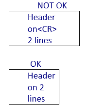 The same within a paragraph. Why is that? Hard returns would prevent automatically imported translations to be set correctly: the <CR> code would very unlikely be placed at the right position in translated languages.
 - If you use bullet points, make sure to apply the bullet feature of your graphical software (such as Adobe InDesign), in order to make a bullet list, nicely vertically aligned; and, above all, never use bullets within the same horizontal line.
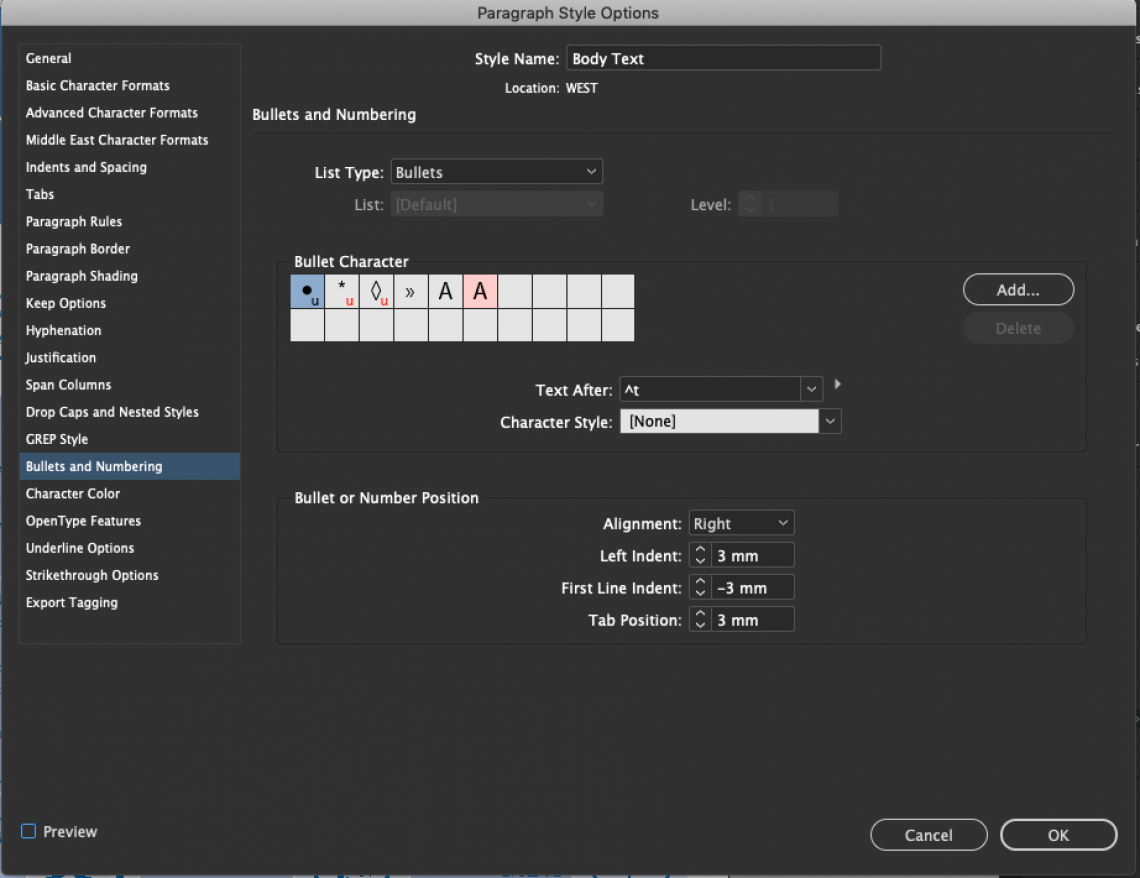
- Under InDesign, use characters and paragraphs stylesheets (even for bullet points). For bullets, please use within the “paragraph styles options panel” the settings “bullets and numbering”. See screenshot below.

- Think of the lengthy languages. Is the source language a short one, like English? Then you will thank yourself afterwards if you leave at least 30% free space on each page for longer languages, like German, Russian, Portuguese, and many others; the same applies of course to all blocks.
- Don’t use poster-size images. Too many people use full-size (poster-like) visuals that end up on the page in a thumbnail or even average-sized format. That doesn’t make much sense, right? Even more so because it will add huge weight to your graphical files and make their manipulation cumbersome, at the opening, editing and saving stages.
- Make sure your pictograms are editable. Pictograms often contain embedded text. As a matter of precaution, make this text editable as well. You will avoid a lot of time loss.
- Include the captions of your illustrations in InDesign. Illustrations are very often designed using Adobe Illustrator or Photoshop. Many designers tend to embed the captions within the illustrations. For translation purposes, the source file should then be provided with a layer, and not outlined. Or, better, captions should be included in the InDesign file.
- Make “actual” tables. In your design create tables using the appropriate table feature and not text blocks with tabs (see screenshot below).
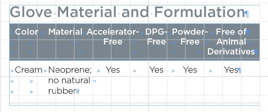 As a result, tables will be much easier to enlarge or adapt when translation is longer than the English source.
 - Do not use tabs inside text blocks. This would disrupt the layout of lengthier languages.
Good luck, now. And feel free to contact us if you are hunger for more ;-)